Wednesday, 27 January 2016

Pearson's Correlation Coefficient

Pearson's Correlation Coefficient


In statistics, the Pearson product-moment correlation coefficient  is a measure of the linear correlation between two variables X and Y, giving a value between +1 and −1 inclusive, where 1 is total positive correlation, 0 is no correlation, and −1 is total negative correlation. It is widely used in the sciences as a measure of the degree of linear dependence between two variables.

Pearson's correlation coefficient is the covariance of the two variables divided by the product of their standard deviations

Pearson's correlation coefficient when applied to a population is commonly represented by the Greek letter ρ (rho) and may be referred to as the population correlation coefficient or the population Pearson correlation coefficient. The formula for ρ[7] is:
 \rho_{X,Y}= \frac{\operatorname{cov}(X,Y)}{\sigma_X \sigma_Y}
where:
The formula for ρ can be expressed in terms of mean and expectation. Since
Then the formula for ρ can also be written as
 \rho_{X,Y}=\frac{\operatorname{E}[(X-\mu_X)(Y-\mu_Y)]}{\sigma_X\sigma_Y}
where:
  •  \operatorname{cov}  and  \sigma_X  are defined as above
  •  \mu_X  is the mean of  X
  •  \operatorname{E}  is the expectation.
The formula for ρ can be expressed in terms of uncentered moments. Since
  • \mu_X=\operatorname{E}[X]
  • \mu_Y=\operatorname{E}[Y]
  • \sigma_X^2=\operatorname{E}[(X-\operatorname{E}[X])^2]=\operatorname{E}[X^2]-\operatorname{E}[X]^2
  • \sigma_Y^2=\operatorname{E}[(Y-\operatorname{E}[Y])^2]=\operatorname{E}[Y^2]-\operatorname{E}[Y]^2
  • \operatorname{E}[(X-\mu_X)(Y-\mu_Y)]=\operatorname{E}[(X-\operatorname{E}[X])(Y-\operatorname{E}[Y])]=\operatorname{E}[XY]-\operatorname{E}[X]\operatorname{E}[Y],\,
Then the formula for ρ can also be written as
\rho_{X,Y}=\frac{\operatorname{E}[XY]-\operatorname{E}[X]\operatorname{E}[Y]}{\sqrt{\operatorname{E}[X^2]-\operatorname{E}[X]^2}~\sqrt{\operatorname{E}[Y^2]- \operatorname{E}[Y]^2}}.

 Covariance is a measure of how much two random variables change together. If the greater values of one variable mainly correspond with the greater values of the other variable, and the same holds for the smaller values, i.e., the variables tend to show similar behavior, the covariance is positive.[1] In the opposite case, when the greater values of one variable mainly correspond to the smaller values of the other, i.e., the variables tend to show opposite behavior, the covariance is negative. The sign of the covariance therefore shows the tendency in the linear relationship between the variables. The magnitude of the covariance is not easy to interpret. The normalized version of the covariance, the correlation coefficient, however, shows by its magnitude the strength of the linear relation.

Correlation is a technique for investigating the relationship between two quantitative, continuous variables, for example, age and blood pressure. Pearson's correlation coefficient (r) is a measure of the strength of the association between the two variables.
The first step in studying the relationship between two continuous variables is to draw a scatter plot of the variables to check for linearity. The correlation coefficient should not be calculated if the relationship is not linear. For correlation only purposes, it does not really matter on which axis the variables are plotted. However, conventionally, the independent (or explanatory) variable is plotted on the x-axis (horizontally) and the dependent (or response) variable is plotted on the y-axis (vertically).
The nearer the scatter of points is to a straight line, the higher the strength of association between the variables. Also, it does not matter what measurement units are used.

Values of Pearson's correlation coefficient

Pearson's correlation coefficient (r) for continuous (interval level) data ranges from -1 to +1:
r = -1data lie on a perfect straight line with a negative slopedata lie on a perfect straight line with a negative slope
r = 0no linear relationship between the variablesno linear relationship between the variables
r = +1data lie on a perfect straight line with a positive slopedata lie on a perfect straight line with a positive slope
Positive correlation indicates that both variables increase or decrease together, whereas negative correlation indicates that as one variable increases, so the other decreases, and vice versa.

Support Vector Machine With R

Support Vector Machine With R
In this article I will show how to use R to perform a Support Vector Regression.
We will first do a simple linear regression, then move to the Support Vector Regression so that you can see how the two behave with the same data.

A simple data set

To begin with we will use this simple data set:
I just put some data in excel. I prefer that over using an existing well-known data-set because the purpose of the article is not about the data, but more about the models we will use.
As you can see there seems to be some kind of relation between our two variables X and Y, and it look like we could fit a line which would pass near each point.
Let's do that in R !

Step 1: Simple linear regression in R

Here is the same data in CSV format, I saved it in a file regression.csv :
We can now use R to display the data and fit a line:
01
02
03
04
05
06
07
08
09
10
11
12
# Load the data from the csv file
dataDirectory <- "D:/" # put your own folder here
data <- read.csv(paste(dataDirectory, 'regression.csv', sep=""), header = TRUE)
 
# Plot the data
plot(data, pch=16)
 
# Create a linear regression model
model <- lm(Y ~ X, data)
 
# Add the fitted line
abline(model)
The code above displays the following graph:

Step 2: How good is our regression ?

In order to be able to compare the linear regression with the support vector regression we first need a way to measure how good it is.
To do that we will change a little bit our code to visualize each prediction made by our model
01
02
03
04
05
06
07
08
09
10
11
dataDirectory <- "D:/"
data <- read.csv(paste(dataDirectory, 'regression.csv', sep=""), header = TRUE)
 
plot(data, pch=16)
model <- lm(Y ~ X , data)
 
# make a prediction for each X
predictedY <- predict(model, data)
 
# display the predictions
points(data$X, predictedY, col = "blue", pch=4)
This produces the following graph:
linear model prediction
For each data point  the model makes a prediction  displayed as a blue cross on the graph. The only difference with the previous graph is that the dots are not connected with each other.
In order to measure how good our model is we will compute how much errors it makes.
We can compare each  value with the associated predicted value  and see how far away they are with a simple difference.
Note that the expression  is the error, if we make a perfect prediction i will be equal to  and the error will be zero.
If we do this for each data point and sum the error we will have the sum of the errors, and if we takes the mean we will get the Mean Squared Error (MSE)
MSE=1ni=1n(Y^iYi)2

A common way to measure error in machine learning is to use the Root Mean Squared Error (RMSE) so we will use it instead.
To compute the RMSE  we take the square root and we get the RMSE
RMSE=MSE

Using R we can come with the following code to compute the RMSE
1
2
3
4
5
6
7
rmse <- function(error)
{
  sqrt(mean(error^2))
}
 
error <- model$residuals  # same as data$Y - predictedY
predictionRMSE <- rmse(error)   # 5.703778
We know now that the RMSE of our linear regression model is 5.70. Let's try to improve it with SVR !

Step 3: Support Vector Regression

In order to create a SVR model with R you will need the package e1071. So be sure to install it and to add the library(e1071) line at the start of your file.
Below is the code to make predictions with Support Vector Regression:
1
2
3
4
5
model <- svm(Y ~ X , data)
 
predictedY <- predict(model, data)
 
points(data$X, predictedY, col = "red", pch=4)
As you can see it looks a lot like the linear regression code. Note that we called the svmfunction (not svr !)  it's because this function can also be used to make classifications with Support Vector Machine. The function will automatically choose SVM if it detects that the data is categorical (if the variable is a factor in R).
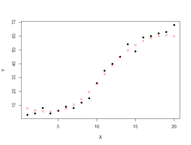
The code draws the following graph:
Support Vector Regression Predictions
This time the predictions is closer to the real values ! Let's compute the RMSE of our support vector regression model.
1
2
3
4
# /!\ this time  svrModel$residuals  is not the same as data$Y - predictedY
# so we compute the error like this
error <- data$Y - predictedY
svrPredictionRMSE <- rmse(error)  # 3.157061
As expected the RMSE is better, it is now 3.15  compared to 5.70 before.
But can we do better ?

Step 4: Tuning your support vector regression model

In order to improve the performance of the support vector regression we will need to select the best parameters for the model.
In our previous example, we performed an epsilon-regression, we did not set any value forepsilon ϵ ), but it took a default value of 0.1.  There is also a cost parameter which we can change to avoid overfitting.
The process of choosing these parameters is called hyperparameter optimization, or model selection.
The standard way of doing it is by doing a grid search. It means we will train a lot of models for the different couples of ϵ and cost, and choose the best one.
1
2
3
4
5
6
7
8
# perform a grid search
tuneResult <- tune(svm, Y ~ X,  data = data,
              ranges = list(epsilon = seq(0,1,0.1), cost = 2^(2:9))
)
print(tuneResult)
# best performance: MSE = 8.371412, RMSE = 2.89 epsilon 1e-04 cost 4
# Draw the tuning graph
plot(tuneResult)
There is two important points in the code above:
  •  we use the tune method to train models with ϵ=0,0.1,0.2,...,1  and cost = 22,23,24,...,29 which means it will train  88 models (it can take a long time)
  • the tuneResult returns the MSE, don't forget to convert it to RMSE before comparing the value to our previous model.
The last line plot the result of the grid search:
support-vector regression performance 1
 support-vector regression performance 1
On this graph we can see that the darker the region is the better our model is (because the RMSE is closer to zero in darker regions).
This means we can try another grid search in a narrower range we will try with ϵ values between 0 and 0.2. It does not look like the cost value is having an effect for the moment so we will keep it as it is to see if it changes.
1
2
3
4
5
6
tuneResult <- tune(svm, Y ~ X,  data = data,
                   ranges = list(epsilon = seq(0,0.2,0.01), cost = 2^(2:9))
)
 
print(tuneResult)
plot(tuneResult)
We trained different 168 models with this small piece of code.
As we zoomed-in inside the dark region we can see that there is several darker patch.
From the graph you can see that models with C between 200 and 300 and ϵ between 0.8 and 0.9 have less error.
support vector regression performance 2support vector regression performance 2
Hopefully for us, we don't have to select the best model with our eyes and R allows us to get it very easily and use it to make predictions.
1
2
3
4
5
6
7
8
tunedModel <- tuneResult$best.model
tunedModelY <- predict(tunedModel, data)
 
error <- data$Y - tunedModelY 
 
# this value can be different on your computer
# because the tune method  randomly shuffles the data
tunedModelRMSE <- rmse(error)  # 2.219642 
We improved again the RMSE of our support vector regression model !
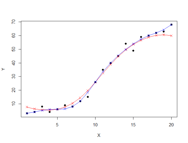
If we want we can visualize both our models. The first SVR model is in red, and the tuned SVR model is in blue on the graph below :
support vector regression comparaison

You can find the implementation here : Download Code
 
Reference : http://www.svm-tutorial.com/